Showing posts with label copper. Show all posts

Friday, May 21, 2010

Color palettes are cruel.

I am clearly a big fan of inspiration boards and color palettes for wedding or event planning. Or for home decorating. Or darn near anything.

Months ago I did a post describing what I imagined for our wedding colors. As my ideas moved toward reality, I discovered something important. Color matching for an event is a bitch. Especially if you're trying to do it on a budget. You can have fourteen different things that are described as "chocolate brown" and no two will match. Not only will they not match, they'll clash. A lot.

We wanted shades of brown, and moss green. I had chocolate brown tablecloths that I had purchased on eBay*. I had chair cover samples. I had napkin samples. I had paper samples, because I'm making our wedding invitations. Nothing matched. Not even a little bit. And I had a lot of things to choose from.

I had shown Dylan the samples and swatches as they'd arrived. He'd nod and smile and say something like, "Those look really nice, babe!" Then one day he came home, and I was edging toward a melt down. I tried to explain that nothing was matching, and I was losing my mind. He shifted his weight nervously and cautiously admitted, "They all kind of looked the same to me." And I know that nearly every man on earth would have thought the same thing. It wasn't his fault. I did my best not to stomp my feet and start sputtering. I'm not entirely sure I succeeded, but at least I didn't yell at him. Instead, I rushed around the house and gathered every piece of fabric or paper or anything else wedding related and tossed it all into the center of our dining room table. I spread it all out, flipped the light on, and threw my arms open in a triumphant presentation. Dylan took it all in for a moment, and his brow furrowed. Finally he said, "Wow. It really doesn't match. None of it. It actually kinda... clashes." I take it as a small credit to my character that I didn't start laughing maniacally and yanking my hair out.

Don't get me wrong -- I am not a "bridezilla". I have been pretty calm and collected about wedding planning. It's just that I had put well over a year into researching and planning, and my lofty ideas were suddenly being thrown out the window.

When my color-clashing meltdown finally came, I decided it was time to re-think things. I took all of the things we already had, and all of the samples that we had, and decided to see what might work together instead of trying to make things work with the image I had in my head. As I started looking at everything, I also found myself favoring certain samples. For example, I had beautiful satin pillowcase style chair cover samples in ivory, pale silver, and chocolate brown. Even though it was the least obvious choice, the pale silver was our favorite. The fabric seems a little nicer, and in the soft lighting of our wedding venue, they give this sense of luxury and romance that the other two just didn't live up to.

Early in the wedding planning stages, I was overzealous and purchased some metallic copper crinkle tablecloths. If you look at my first two inspiration boards, you'll see what I'm talking about. They're beautiful, but I was worried that the color would be hard to match things to. I had started leaning toward using brown instead copper, because I thought it would be easier to use as part of the color palette. (Ha ha! Silly me!) That led me to buy those chocolate brown tablecloths**.

We decided to choose what parts we liked best, and then be more flexible on the rest so we could make it all work. We are going to use the copper tablecloths and the pale silver chair covers. We went to fabric shops and found a beautiful paisley fabric that ties the whole thing together. I waited until Joann Fabrics had a 50% off coupon and bought enough fabric to make runners for all of the tables.

So this is a mish-mash of what we've got:

Oh, and Dylan's Ben Sherman suit did not fit him properly. In the picture above, you can see the sleeve of the suit we ended up finding for him. It's a really dark navy, or maybe midnight blue. The suit jacket is two button and looks great on him. Our favorite part is that it's actually a three piece suit! Dylan looks so good in a vest. Plus, he over-heats easily, so it'll be a bonus for him to able to take off his jacket during the reception and still look dressed up.

The bottom line is that color palettes and inspiration boards are wonderful, but don't let yourself get too caught up in forcing your wedding details to fit into a preconceived palette before you explore and experiment with what is actually available to you.

* Budget Helper: I have discovered that for things like table linens and chair covers, I can usually buy them for less than I could rent them. Besides the fact that it's initially cheaper, I love the idea of being able to pass on the savings to another couple while recouping some of your expenses. eBay and Craigslist are both big money savers if you're a savvy shopper. Linentablecloth.com is also a good website if you're considering buying your own table-linens. You can also purchase napkin samples for $1, which is a nice way of getting a big fabric swatch to use for color comparisson. If there is one thing that I have learned from this experience, it is to buy the damn samples before you place a big order. It will save you time and money in the long run, and most of all, it will keep you from ripping your hair out when you discover that one company's idea of "sage green" is what you would have call olive green and another is almost blue.

** Even if you're a savvy shopper, some people are not as forthcoming and honest as they should be. Those chocolate brown tablecloths are not nearly as nice as that lady described, and some of them have stains or wonky hems. I've been cranky about them ever since. So again, if you have the option of seeing stuff in person or ordering a sample first, do it.

Wednesday, August 5, 2009

Peacock Wedding Theme with Copper and Teal Blue

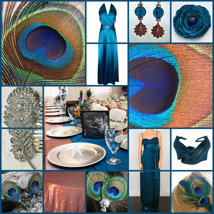
Early in my daydreaming about what our wedding could look like, I found myself liking the idea of using peacock feathers to add a little flair to a wedding of rich jewel tones. I have since dabbled with peacock palettes and themes a few times, but never quite put it together in a way that I thought really clicked for me. What I came up with for today's board is a little bit different take on peacock wedding themes, because I focused primarily on an almost exotic feeling color combination of shimmering copper and dark teal blue. You could certainly add the emerald green, chartreuse, deep purple, bronze and navy blue to accent the gorgeous iridescence of the peacock feathers. I just decided to simplify it by streamlining the color palette a bit and choosing two of my favorites. I also think that texture plays an especially big role in today's board.

Something I really love about the deep teal is that I think it could be gorgeous on darn near anyone.

In an early engagement splurge purchase, I bought an eBay auction lot of copper tablecloths because I've been fascinated with that color and was convinced I could make it work. (I also bought them for a better price than I could've rented white linens, so what the heck.) I have second guessed myself to infinity and beyond, but I think this palette is an example where the copper really does work beautifully.

{click to enlarge}

One of my favorite parts of this board is the fabulous Kayla dress in teal chiffon by Thread. I love chiffon. I love empire waist. I love the satin sash with the draping bow. And I love that color!

The second dress is a Rhinestone Pin Satin Halter Gown that I found on Amazon for only $70. Satin is another great fabric for this palette because it seems so rich and elegant. The shoes are Two Lips Vivacious Teal Wedges from Endless.com.

The center picture of the table is from Gamboa Photos.

The copper tablecloth on the bottom row is actually a picture I took of one of my tablecloths.

The sparkling rhinestone peacock feather hair comb is something that I found on eBay.

That brings us to my Etsy finds:

The pretty antique copper and teal glass sea scallop earrings are called Atlantic Bay by The Moss Garden. I know they're supposed to be sea scallops, but the shell shape is pretty similar to a peacock with it's feathers fanned out, so I kind of cheated there. I like the little rhinestone spacers, too. It dresses them up a bit.

The Glamorous Peacock Eye Feather Rhinestone Hair Clip in the center of the bottom row is by Dana Castle. I like that it's simple, but with a little rhinestone embellishment to add some sparkle.

The Tamara Peacock Feather Hairpins on the bottom left corner are by Piper Riley. Her hair accessories have pretty details because she uses little bits of other bold feathers to make them interesting.

The Contessa Peacock Headband in the bottom right corner is by sweetgrassmill. This one is a little more funky, but most girls who would chose a peacock theme for their wedding could probably pull off a little funky. Plus, that headband looks like it would match perfectly with that Thread dress!

The Satin Flower Brooch is by dollmeat. I deliberately left flowers out of this board, because I think the feathers are almost a floral alternative when it comes to bright, colorful accents in the wedding decor. This satin flower brooch with the darker blue jewel goes nicely with the theme, and adds fun texture without taking away from the colorful peacock feathers.

Oooo, and I just found this teal dress and this peacock dress at Nordstrom.


Tuesday, July 21, 2009

Lilac, Bronze and Dark Chocolate Brown

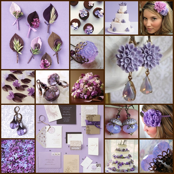
When we got engaged, my first idea for a wedding color palette was lilac and dark chocolate brown. The few people I mentioned this to looked at me like I was crazy. This was before I had discovered the magic of inspiration boards, and I could not find good examples of the color combination I was imagining. I have gradually found a decent assortment of light purple with brown, copper and bronze wedding related pictures. This seems to be a particularly difficult color scheme to find in uniform, matching shades. I've decided to take Martha Stewart's cue and mix and match a bit. In this palette you'll find shades of purple that could be described as lilac, lavender, orchid, light violet, and maybe even periwinkle. I did find a lot of beautiful jewelry on Etsy that did a nice job of highlighting the color palette I was looking for, so I'm using extra Etsy crafts today.

{click to enlarge}

  1. Lilac and brown themed boutonnieres by Martha Stewart. I love fiddlehead ferns!
  2. Swiss meringue buttercream flower cupcakes by Martha Stewart.
  3. A wedding cake decorated with fresh lilacs, but I can't remember where it came from.
  4. Etsy Find: The Airy - double fluff chiffon headband by Mandizzle. Her lovely floral hair accessories are almost as gorgeous as she is!
  5. Etsy Find: Lilac Opalescent Earrings by Candies64. I love their luminescent color.
  6. Etsy Find: Romance Collection - Marianne Earrings by La Boite a Bijoux. I love the flowers combined with the opalescent gems.
  7. Leafy placecards by Martha Stewart.
  8. Etsy Find: Amethyst purple faceted glass earrings with copper by ShySiren. These have a pretty copper / bronze element.
  9. Lilac, sweetpea, lamb's ear and lisianthus bouquet from Martha Stewart.
  10. Etsy Find: Lilac drops by Kneehighs & Pigtails. These make an impact with the clarity of color and sharper facets.
  11. Lovely lilac and brown stationery assortment by Martha Stewart.
  12. Etsy Find: My Little Acorn earrings by AmberSky. Her jewelry has a beautiful vintage style. I love these -- lilac AND acorns!
  13. Etsy Find: The Flora - layers of chiffon petals headband by Mandizzle.
  14. Fresh lilacs!
  15. Wedding cake with purple flowers (hydrangeas?) by Martha Stewart.
  16. Etsy Find: Violet Beauties by bellalu0. I love this color so much!
Bonus Lilac Finds:

Lavender Butterflies Cake Wrap by Paper Orchid Stationery.

They call this Tiered Ruffle Chiffon Dress silver, but it looks pretty purple to me.


This lilac, gray and white seersucker bowtie is from JPress.


Indigo By Clarks Women's Tanzania Pump

Bonus Etsy Finds:


Bella Purple earrings by AmberSky.

Sweet Lilac Breeze earrings by dkjewels.

Vintage Wine Dance earrings by dkjewels.

Catherdral earrings by stregata.

Bijoux Necklace in Alexandrite by Kneehighs & Pigtails.

Thursday, May 14, 2009

Rosy Copper, Mossy Green, Warm Brown

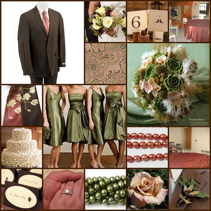
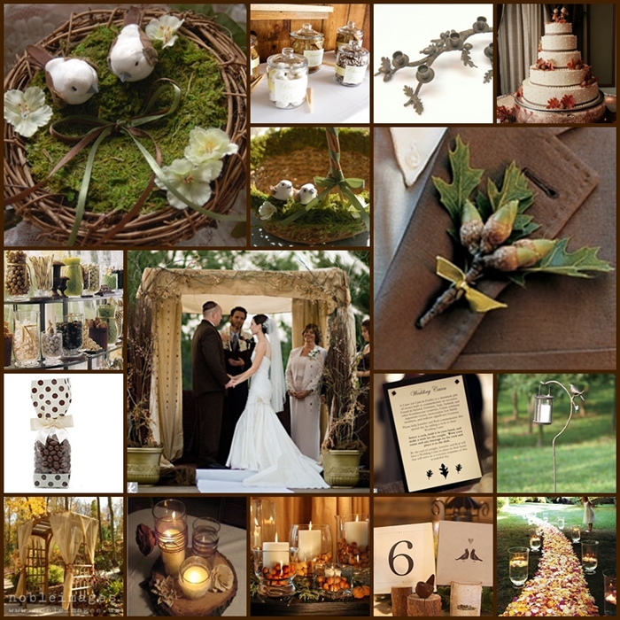
Some of the inspiration boards I've put together have been for us, while others have been for friends or just to have fun with different color combinations or themes. This is our current favorite for early autumn wedding. The colors are rosy copper, mossy green and warm brown.

I wanted to make an autumn inspiration board, but avoid the more stereotypical autumn decor (pumpkins, oranges, yellows, reds). It was important to keep a warm, cozy, autumn feeling. We love the idea of incorporating some flora and fauna with vintage romance. We especially love the lovebirds theme, and acorns because they're a symbol of good luck and potential for the future.

The emphasis for these boards:

  • elegant
  • vintage
  • romantic
  • whimsical
  • woodsy

{click to enlarge pictures}

My favorite parts of the upper inspiration board are the rich textures, the acorn boutonniere and the bouquet with succulents, scabiosa, roses and little tufts of feathers. And my ring, of course!

I found the adorable ring bearer's "nest" and flower girl's basket on Etsy.

We aren't religious, but we love the symbolism behind the Jewish chuppah, and the intimate space it creates for the bride and groom during the ceremony.

We'd like to have an outdoor ceremony, but I think my head would explode if we had to gamble on the weather. We're hoping to bring some of the outdoors in with elements like the oak branch and acorn candleholders (on the top row) and the woodsy decor.

So that's my latest take on an autumn wedding, I hope you enjoy it!